




Case Study
The Rising Tide
A Silicon Valley engineer solved recipe design in 2004. The internet ignored it for 22 years. There's a reason, and it applies to your firm.

Jud Mackrill

If you’ve ever gone looking online for something to make - a meal, a cake, a sauce, a drink- you’ve likely run into a problem.
You clicked on a link to get a recipe, and instead you got a childhood story, fourteen photos of someone processing a chicken, and a wall of text to scroll past before you reach an ingredient list. Once you start making it, you keep scrolling back up to look for just how much of everything you need to add because the instructions aren’t specific.
Of course, the reason that is so cumbersome isn't an accident. It's search engine optimization, pay-per-click ads, and time on screen making the author stand out and helping them earn money.
An entire economy has been built around making things complicated. It’s pretty easy to romanticize the journey and keep your business inside of the complex. Every process has a story behind it. For every client, there’s an anecdote. Everything that needs to get done can get draped in layers of complexity that seem to make your business unique, but ultimately create frustration and drag for your team members and clients.
Which is why a post that went semi-viral this week caught my eye. The claim: someone solved recipe design more than twenty years ago, and everyone just decided to ignore it.
They're right.
His name is Michael Chu. Silicon Valley engineer. In 2004, he built a site called Cooking for Engineers, and he laid recipes out the way an engineer would. As a table.
Ingredients run down the left, in the order you actually use them. Each column to the right is a step. When two things combine, the cells merge. You read it left to right, and the whole dish sits on one screen.
No scrolling. No story. No hunting for what's next.
You can glance at it from across the kitchen, flour on your hands, and know exactly where you are.
It looks like this.
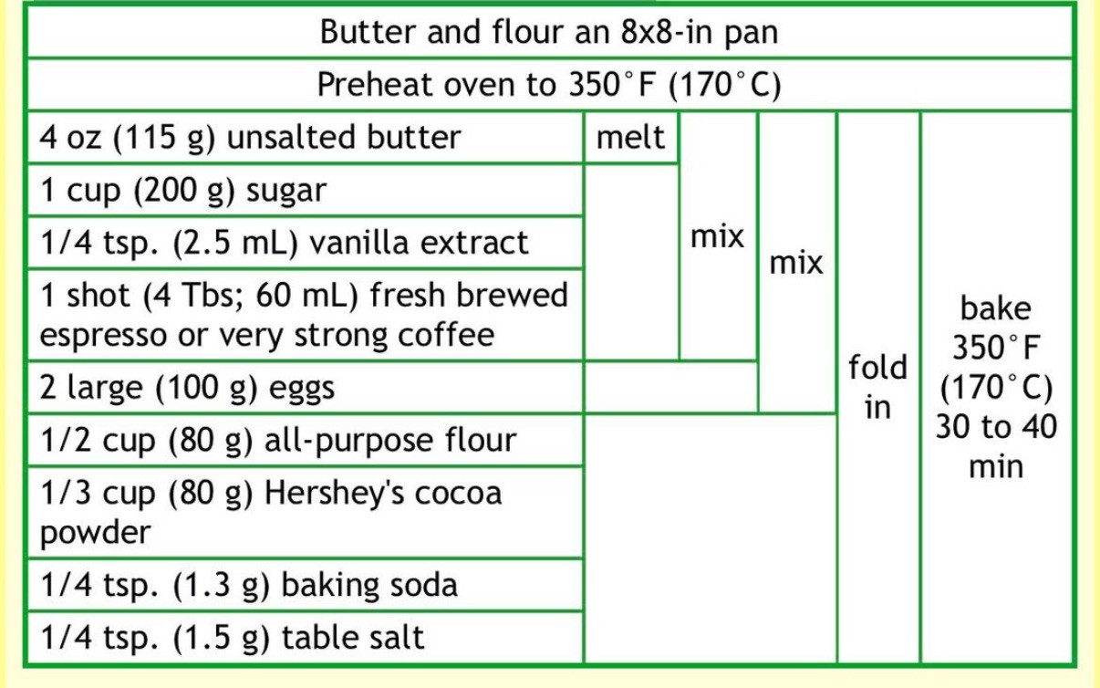
Michael Chu’s Cooking for Engineers Design
It's beautiful. It works. A beginner can follow it.
And the internet buried it for twenty-two years.
Here's the part that stuck with me.
It didn't lose because it was worse. It lost because it was too good.
Recipe blogs don't make money when you cook. They make money when you scroll. Every ad impression needs a few more seconds of your attention, so the page is built to hold you there — the long story, the photos, the slow walk to the recipe box. Time on page is the product. You're the ingredient.
Chu's table solves the problem too efficiently. You screenshot it and close the tab in five seconds. Perfect for you. A disaster for the content creator.
So the better format didn't lose to the more complicated format. It lost to an incentive.
I think about how we write down the way our firms work.
The forty-page onboarding manual. The service model deck nobody opens. The procedure so exhaustive no one has read past page two.
We tell ourselves the length is thoroughness. It usually isn't. It's the same trap, wearing a different suit.
For years, advisors touted thorough, long financial plans. Then they realized that clients responded best to a simplified version, and suddenly everyone was looking for a one-page financial plan.
Your team is looking for something similar. They don’t need a huge binder that’s overly verbose. They need a one-page recipe card to get the work done with ease.
Before this year, your client service, ops, planning, compliance, marketing, and investment teams had to execute your firm’s recipes by digging through binders of information. They had to use their talents to get their work done. When your data is in one place, and you have a trained model on top of it, you can feed your recipe cards into it to make exactly what you want faster than you ever have before. It sounds like magic, but it’s real.
I spent this past week working on some recipes for the Milemarker team to help them gain efficiency, accuracy, and scale. It’s the most transformative work I’ve been a part of in my career.
This week, think about your recipe cards.
What’s on them?
What do you need to cook?
How can you think like an engineer to go from layers of complexity to answers in minutes?
Let me know what you’re cooking.
Case Study
The Rising Tide
A Silicon Valley engineer solved recipe design in 2004. The internet ignored it for 22 years. There's a reason, and it applies to your firm.
Jud Mackrill
If you’ve ever gone looking online for something to make - a meal, a cake, a sauce, a drink- you’ve likely run into a problem.
You clicked on a link to get a recipe, and instead you got a childhood story, fourteen photos of someone processing a chicken, and a wall of text to scroll past before you reach an ingredient list. Once you start making it, you keep scrolling back up to look for just how much of everything you need to add because the instructions aren’t specific.
Of course, the reason that is so cumbersome isn't an accident. It's search engine optimization, pay-per-click ads, and time on screen making the author stand out and helping them earn money.
An entire economy has been built around making things complicated. It’s pretty easy to romanticize the journey and keep your business inside of the complex. Every process has a story behind it. For every client, there’s an anecdote. Everything that needs to get done can get draped in layers of complexity that seem to make your business unique, but ultimately create frustration and drag for your team members and clients.
Which is why a post that went semi-viral this week caught my eye. The claim: someone solved recipe design more than twenty years ago, and everyone just decided to ignore it.
They're right.
His name is Michael Chu. Silicon Valley engineer. In 2004, he built a site called Cooking for Engineers, and he laid recipes out the way an engineer would. As a table.
Ingredients run down the left, in the order you actually use them. Each column to the right is a step. When two things combine, the cells merge. You read it left to right, and the whole dish sits on one screen.
No scrolling. No story. No hunting for what's next.
You can glance at it from across the kitchen, flour on your hands, and know exactly where you are.
It looks like this.
Michael Chu’s Cooking for Engineers Design
It's beautiful. It works. A beginner can follow it.
And the internet buried it for twenty-two years.
Here's the part that stuck with me.
It didn't lose because it was worse. It lost because it was too good.
Recipe blogs don't make money when you cook. They make money when you scroll. Every ad impression needs a few more seconds of your attention, so the page is built to hold you there — the long story, the photos, the slow walk to the recipe box. Time on page is the product. You're the ingredient.
Chu's table solves the problem too efficiently. You screenshot it and close the tab in five seconds. Perfect for you. A disaster for the content creator.
So the better format didn't lose to the more complicated format. It lost to an incentive.
I think about how we write down the way our firms work.
The forty-page onboarding manual. The service model deck nobody opens. The procedure so exhaustive no one has read past page two.
We tell ourselves the length is thoroughness. It usually isn't. It's the same trap, wearing a different suit.
For years, advisors touted thorough, long financial plans. Then they realized that clients responded best to a simplified version, and suddenly everyone was looking for a one-page financial plan.
Your team is looking for something similar. They don’t need a huge binder that’s overly verbose. They need a one-page recipe card to get the work done with ease.
Before this year, your client service, ops, planning, compliance, marketing, and investment teams had to execute your firm’s recipes by digging through binders of information. They had to use their talents to get their work done. When your data is in one place, and you have a trained model on top of it, you can feed your recipe cards into it to make exactly what you want faster than you ever have before. It sounds like magic, but it’s real.
I spent this past week working on some recipes for the Milemarker team to help them gain efficiency, accuracy, and scale. It’s the most transformative work I’ve been a part of in my career.
This week, think about your recipe cards.
What’s on them?
What do you need to cook?
How can you think like an engineer to go from layers of complexity to answers in minutes?
Let me know what you’re cooking.


The Infrastructure for Wealth
Phone
+1 (470) 502-5600
Address
Milemarker Inc.
16192 Coastal Highway
Lewes, Delaware 19958
Built by Teams In:
Atlanta, Charleston, Cincinnati, Denver, Omaha & Portland.



Partners




Platform


Solutions
© 2026 Milemarker Inc. All rights reserved
DISCLAIMER: All product names, logos, and brands are property of their respective owners in the U.S. and other countries, and are used for identification purposes only. Use of these names, logos, and brands does not imply affiliation or endorsement.
The Infrastructure for Wealth
Phone
+1 (470) 502-5600
Address
Milemarker Inc.
16192 Coastal Highway
Lewes, Delaware 19958
Built by Teams In:
Atlanta, Charleston, Cincinnati, Denver, Omaha & Portland.
Partners
Platform
Solutions
© 2026 Milemarker Inc. All rights reserved
DISCLAIMER: All product names, logos, and brands are property of their respective owners in the U.S. and other countries, and are used for identification purposes only. Use of these names, logos, and brands does not imply affiliation or endorsement.
The Infrastructure for Wealth
Phone
+1 (470) 502-5600
Address
Milemarker Inc.
16192 Coastal Highway
Lewes, Delaware 19958
Built by Teams In:
Atlanta, Charleston, Cincinnati, Denver, Omaha & Portland.
Partners
Platform
Solutions
© 2026 Milemarker Inc. All rights reserved
DISCLAIMER: All product names, logos, and brands are property of their respective owners in the U.S. and other countries, and are used for identification purposes only. Use of these names, logos, and brands does not imply affiliation or endorsement.
Empowering Advisors
To Enjoy Every Mile.
Phone
+1 (470) 502-5600
Address
Milemarker Inc.
16192 Coastal Highway
Lewes, Delaware 19958
Built by Teams In:
Atlanta, Charleston, Cincinnati, Denver, Omaha & Portland.
Partners